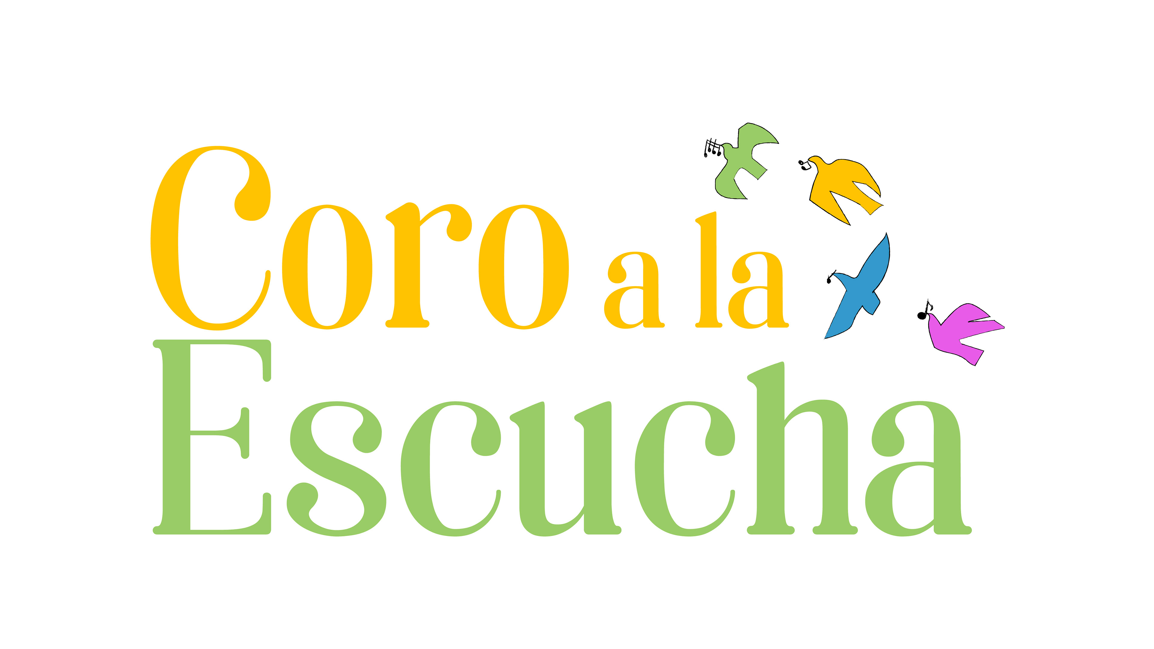
The logo was designed in two stages. First, we created an image for a brochure showcasing the choir. As a graphic designer, it's important to me that each image evokes something. I wanted to represent a group of immigrants and exiles united by singing. The mission was to "create acoustic spaces to share personal narratives of exile and distance, and thus build community."
I chose the symbol of the dove of peace and decided to use several to better represent the community. Each dove is different in color, shape, and wing position, symbolizing each choir member and their journey of exile. The doves have delicate strokes and strong outlines, with lines that change direction dramatically.
The colors reflect the cultural diversity of the choir. Yellow represents warmth and inner sun. Blue is cooler, and purple acknowledges the presence of women.